My UX projects range from website and app updates to instructional performance art pieces. When it comes to setting users or participants on a journey, I aim to create language that guides and instructs, countering possibilites of interpretation through multi-path systems.
Below you can look through projects that explore this in both the digital and physical realms.
Before and After:
Updating Webpages with UX in Mind
Fall of 2022 I earned a certificate in User Experience writing at the University of Washington. In the course I learned key techniques for researching heuristics and adapting copy to be more user friendly.
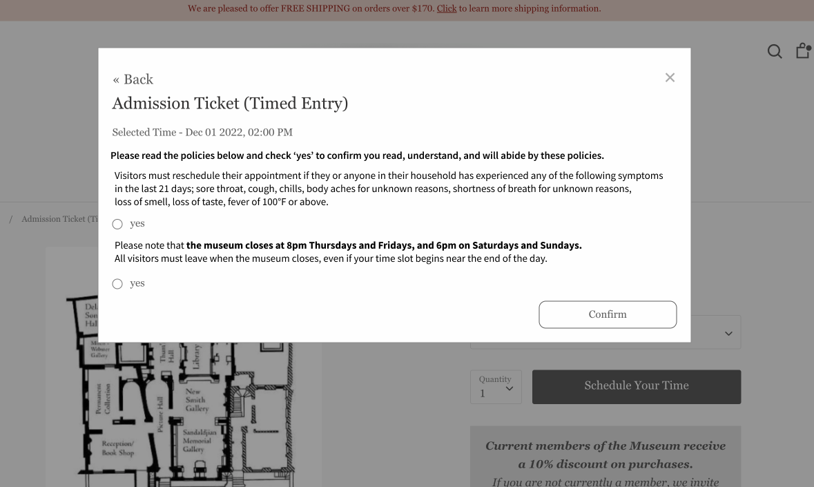
Project 1: The Museum of Jurassic Technology
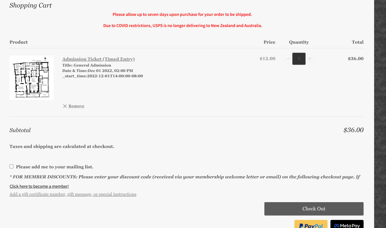
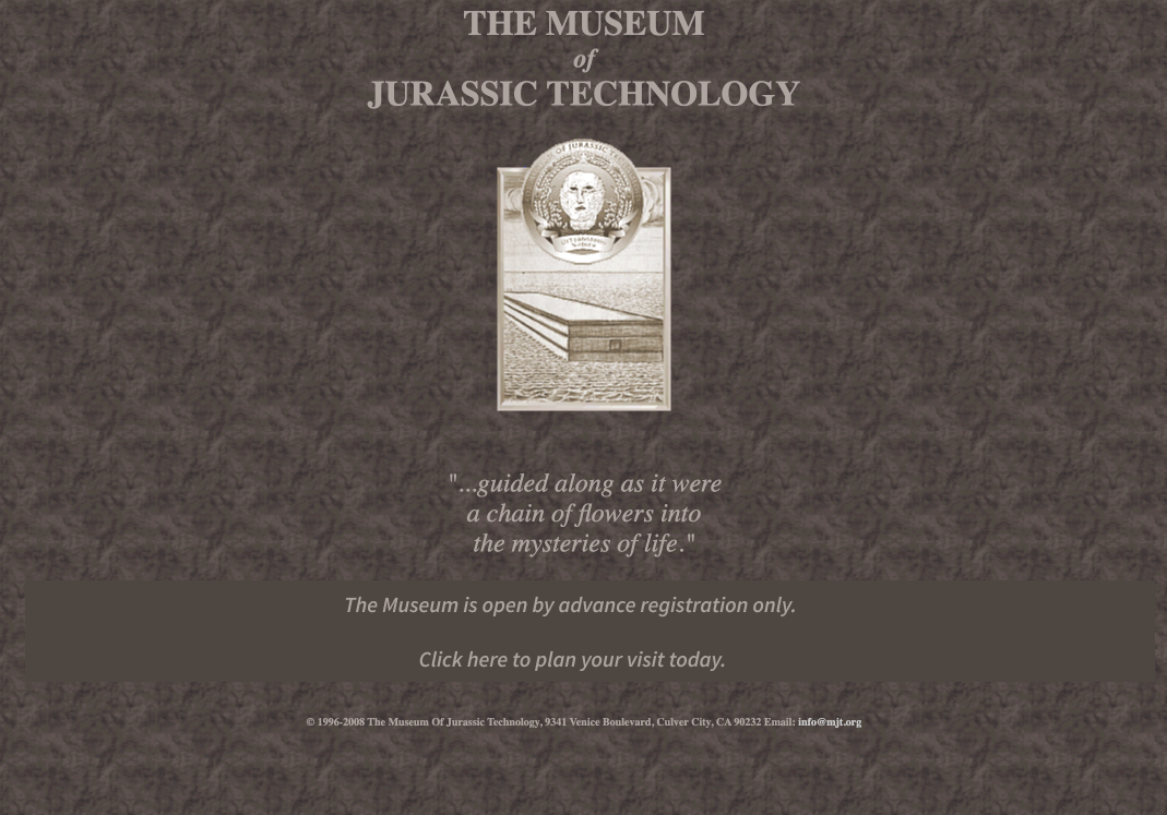
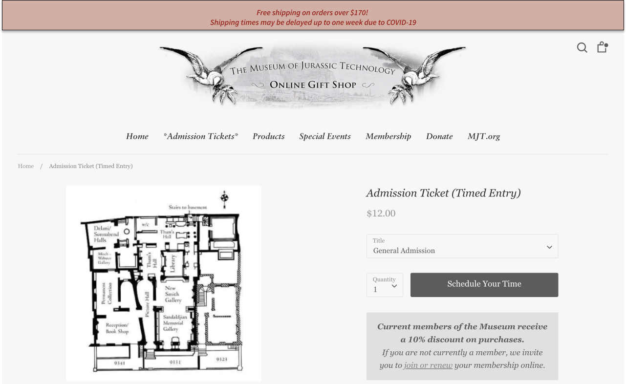
Click through the slides to see before and after UX updates to this user flow of buying tickets.
Below you can look through projects that explore this in both the digital and physical realms.
Before and After:
Updating Webpages with UX in Mind
Fall of 2022 I earned a certificate in User Experience writing at the University of Washington. In the course I learned key techniques for researching heuristics and adapting copy to be more user friendly.
Project 1: The Museum of Jurassic Technology
For my first class project, I updated the website copy for the Museum of Jurassic Technology to unify their brand voice and improve the user journey for purchasing tickets.
Click through the slides to see before and after UX updates to this user flow of buying tickets.

My UX performance art piece, Slow Dance x Schindler House at the MAK Center for Art & Architexture’s Centennial Celebration. UX writing creates accessability; my two-channel, two-person, audio tour of the Schindler House is designed to help visitors create a more personal and physical connection to the house, and their ‘dancing’ partner. To see my project for the Mak Center, head here.
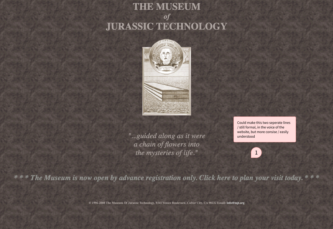
On the landing page, I only simplified slightly. The feel and brand voice for the MoJT is elaborate, ancient, and stately; the landing page is the place to establish that.

This page required more updates, including altering micro-copy.

Though the copy was working functionally here, I changed the tone to better fit MoJT’s brand voice.


This page was ok as-is.


Here I simplified and clarified on admission policies.

This page felt like it was trying to carry to much information in one place. I simplified, imagining more places for the information to be presented down the line.